ST201 Data Analysis
Numerical Data
🚴 Watt Test Challenge: 7 Rounds! 🚴

🏋️♂️ Goal: Achieve an average of 160 watts
⏲️ Time: 2 minutes per round
💡 Pro Tip: Adjust the resistance to push your wattage higher!
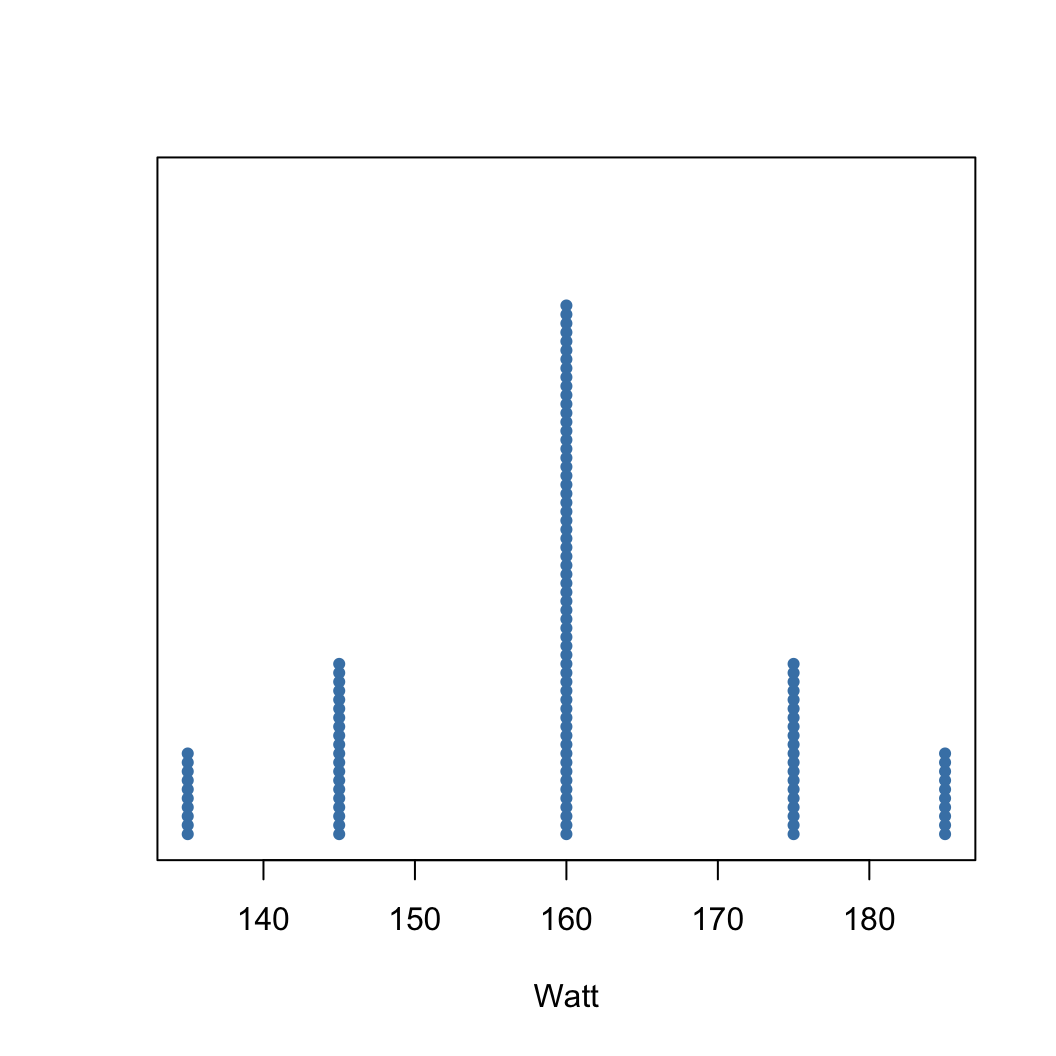
Visualisation - Dot plots
A dot plot provides the most basic of displays when we are interested in the distribution of a single variable.
- A dot plot is a one-variable scatterplot;
- an example using 120 watt values is shown:
Visualisation - Dot plots
We could achieve a similar average in a different way:

Visualisation - Dot plots
We could achieve a similar average in a different way:
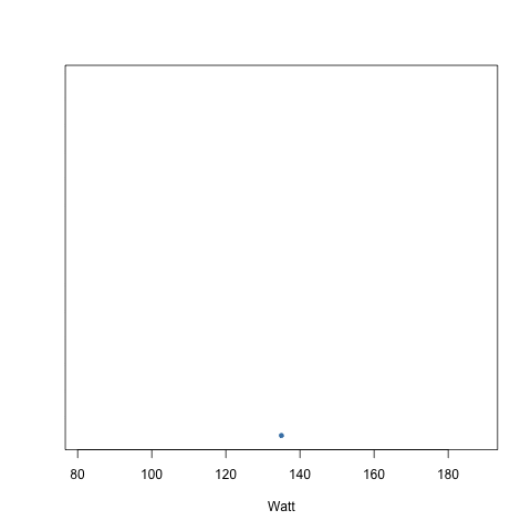
Scatter Plots
We could also consider visualising two variables here as a scatter plot if we include the time aspect.
Consider the following strategy:
- get a 160 watt average in a 2 minute interval
- have a steady increase every 10 seconds
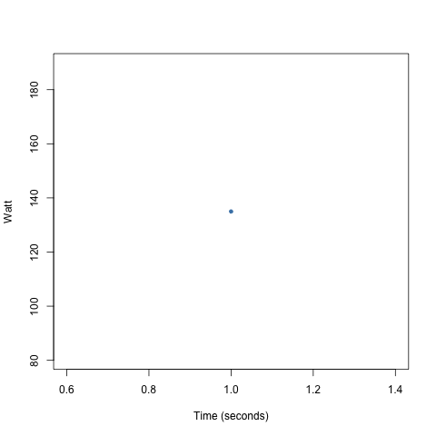
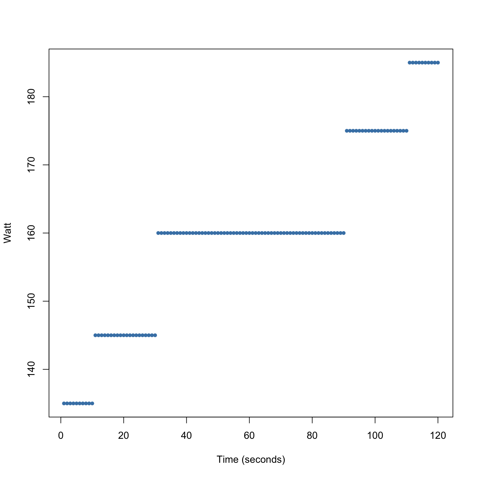
Scatter Plots
We could also consider visualising two variables here as a scatter plot if we include the time aspect.
Consider the following strategy:
- get a 160 watt average in a 2 minute interval
- have a steady increase every 10 seconds

Scatter Plots
We can change the strategy and still maintain the same average.
Consider the following strategy:
- get a 160 watt average in a 2 minute interval
- have a longer period of 160 watts

Scatter Plots
We can change the strategy and still maintain the same average.
Consider the following strategy:
- get a 160 watt average in a 2 minute interval
- have a longer period of 160 watts
Scatter Plots
We can change the strategy and still maintain the same average.
Consider the following strategy:
- get a 160 watt average in a 2 minute interval
- have a steady decrease every 10 seconds
Scatter Plots
We can change the strategy and still maintain the same average.
Consider the following strategy:
- get a 160 watt average in a 2 minute interval
- have a steady decrease every 10 seconds

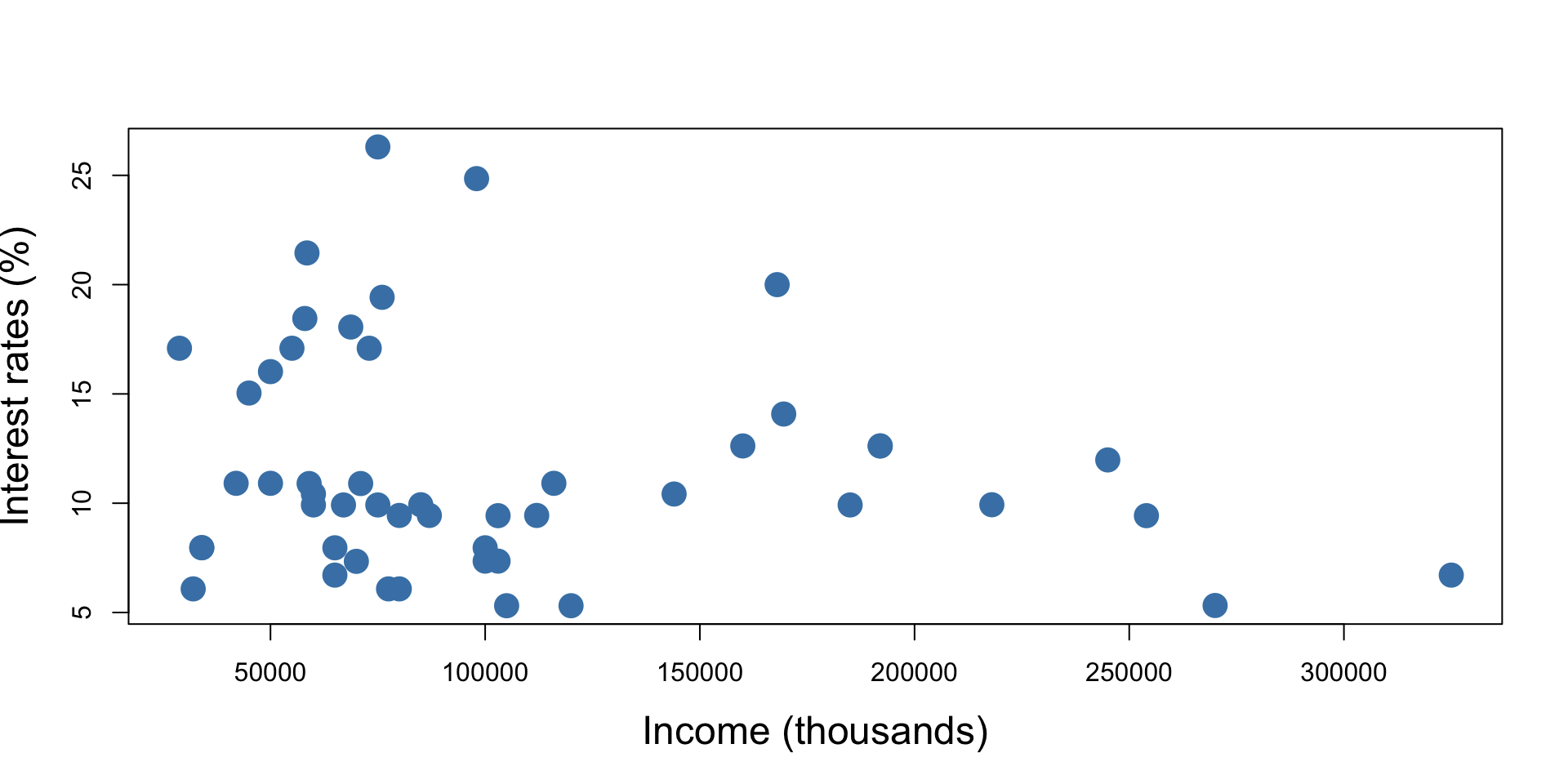
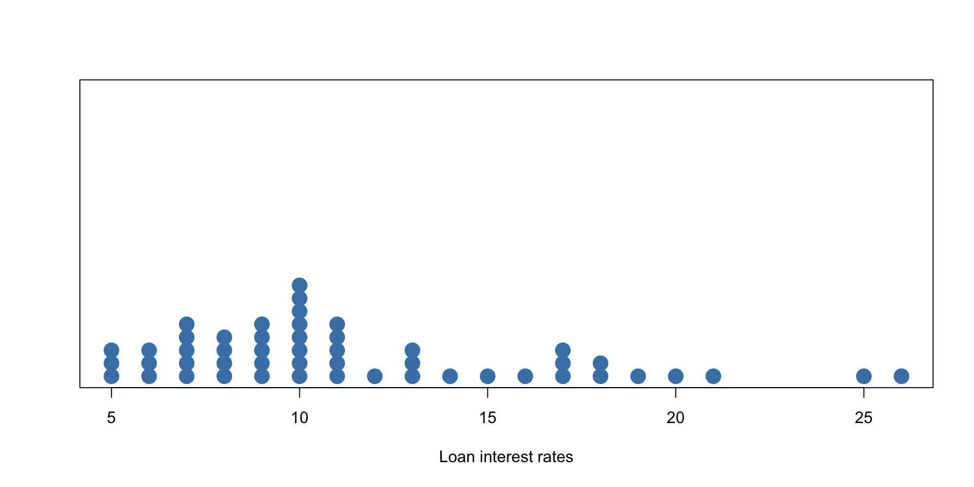
Example - Loan Interest Rates
A dot plot of the (rounded) loan interest rate data is shown below:

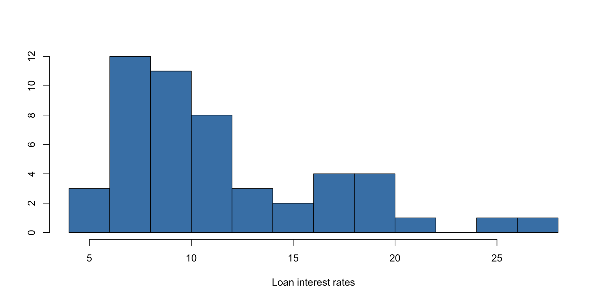
Example - Loan Interest Rates
A histogram is a plot that shows the distribution of data by grouping values into bins and displaying their frequencies as bars. A histogram of the loan interest rate data is shown below:

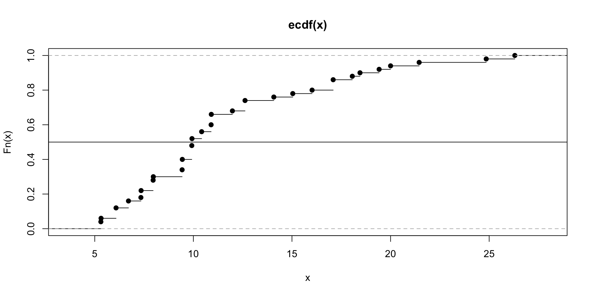
Median - Loan Interest Rates
- Recall the ECDF? It shows the proportion of data points less than or equal to each value. Let’s look at it for the interest rate data and get an idea of where the median is.

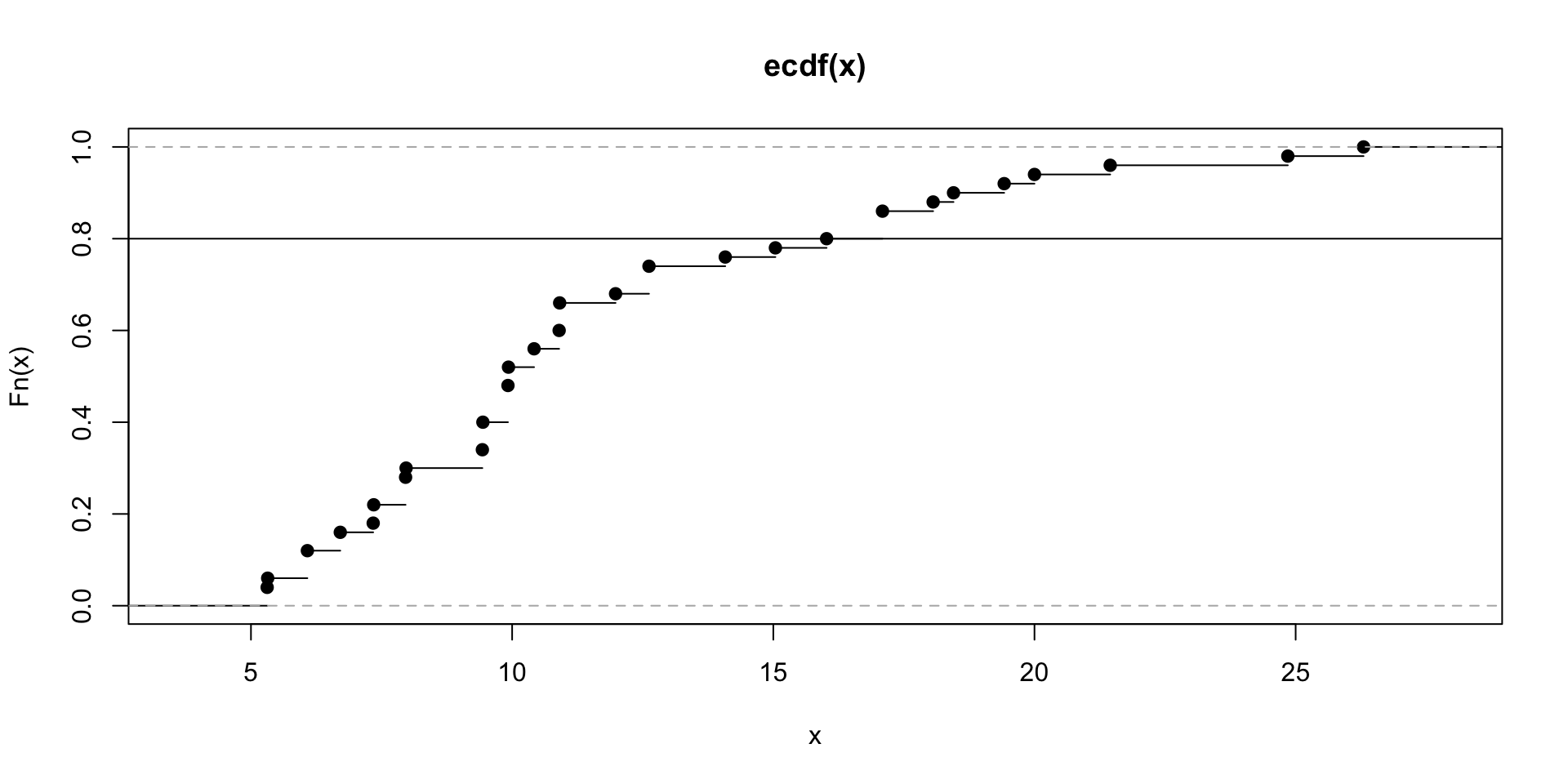
Quantiles
- Let’s look at the ECDF for the interest rate data and get an idea of where the 80th percentile is.
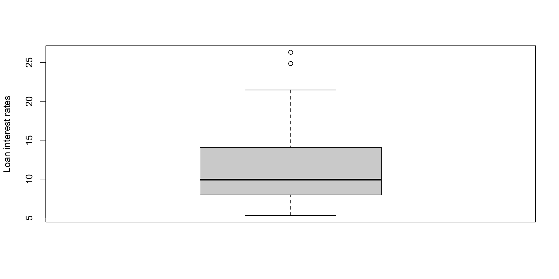
Boxplots
A boxplot is a graphical summary of data that shows its median, quartiles, spread, and potential outliers. Consider a boxplot of the interest rates.

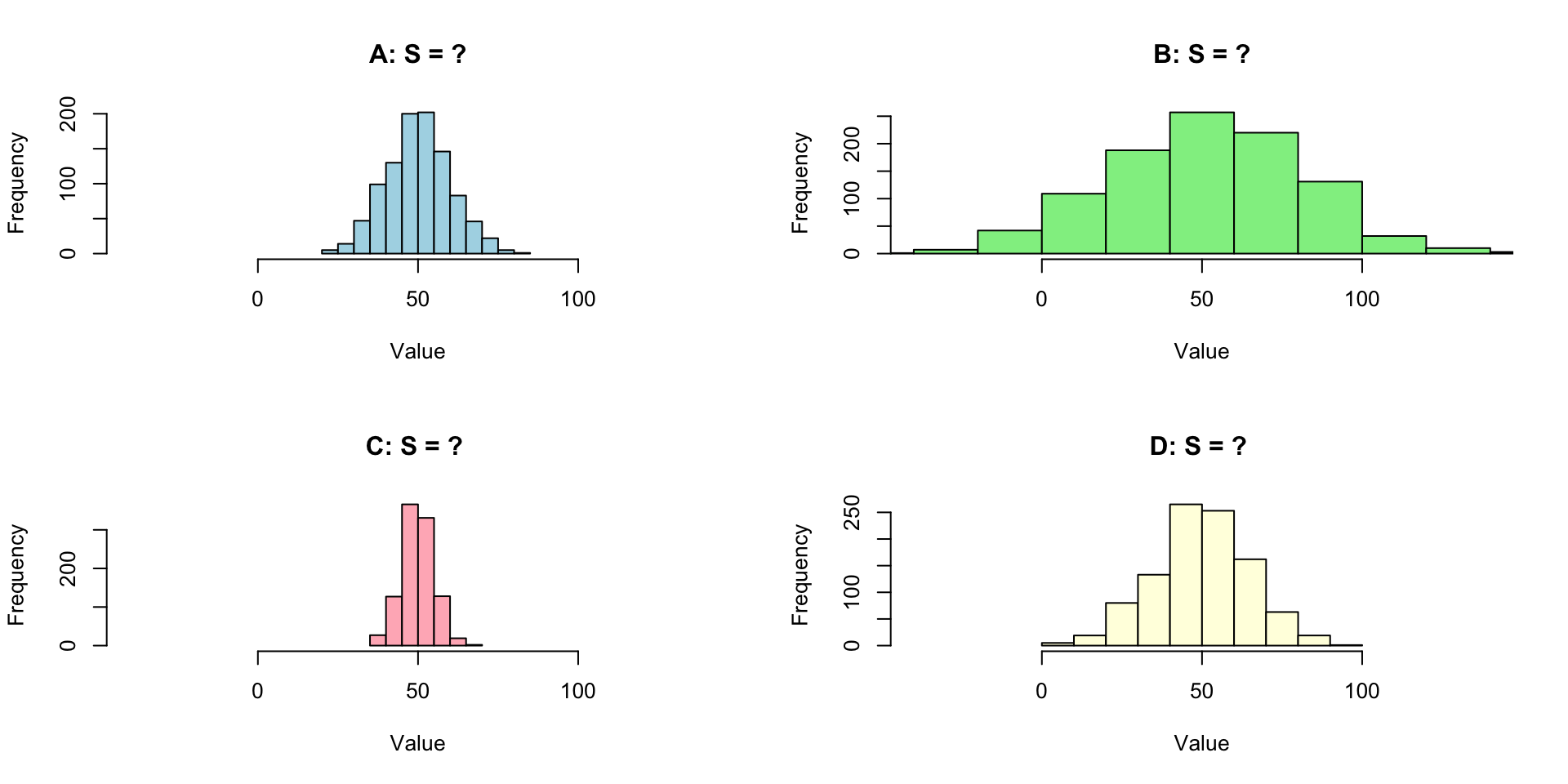
Changing variances/standard deviations
Which histogram has s = 5, 10, 15, 20
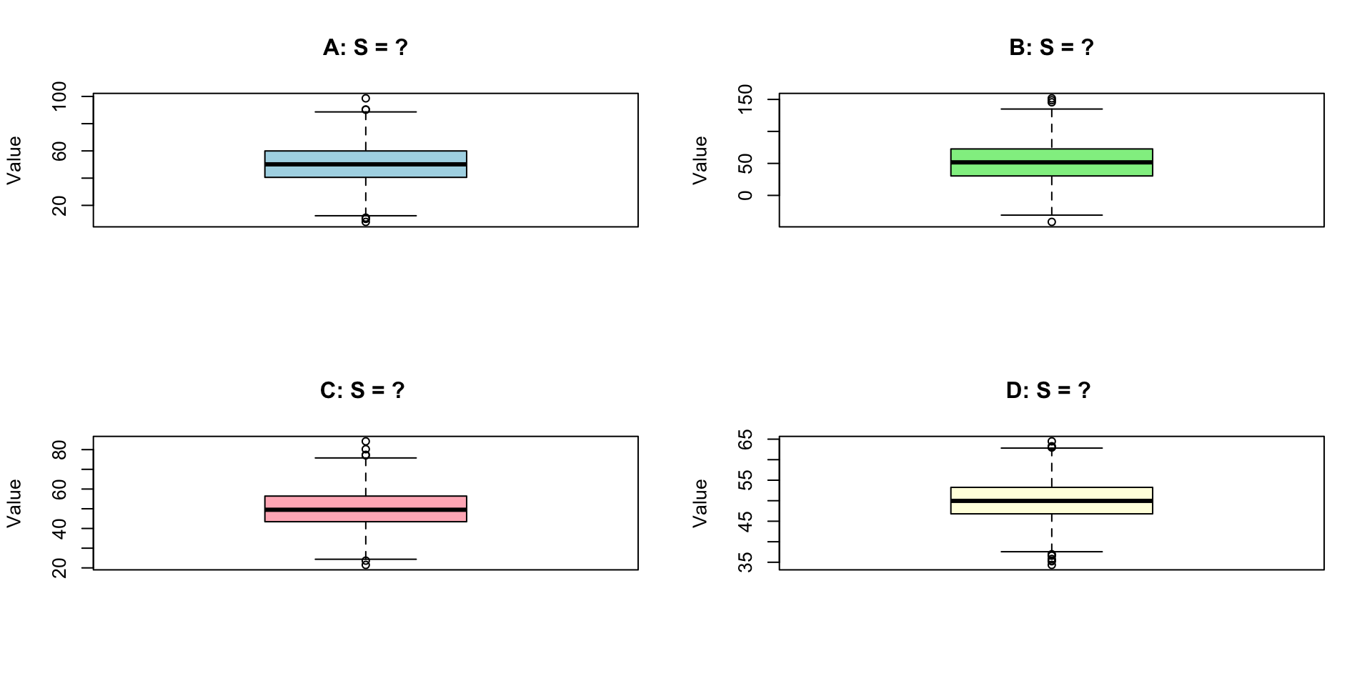
Changing variances/standard deviations
Which boxplot has s = 5, 10, 15, 20
Robust statistics - Mean vs Median
- red = mean
- green = median
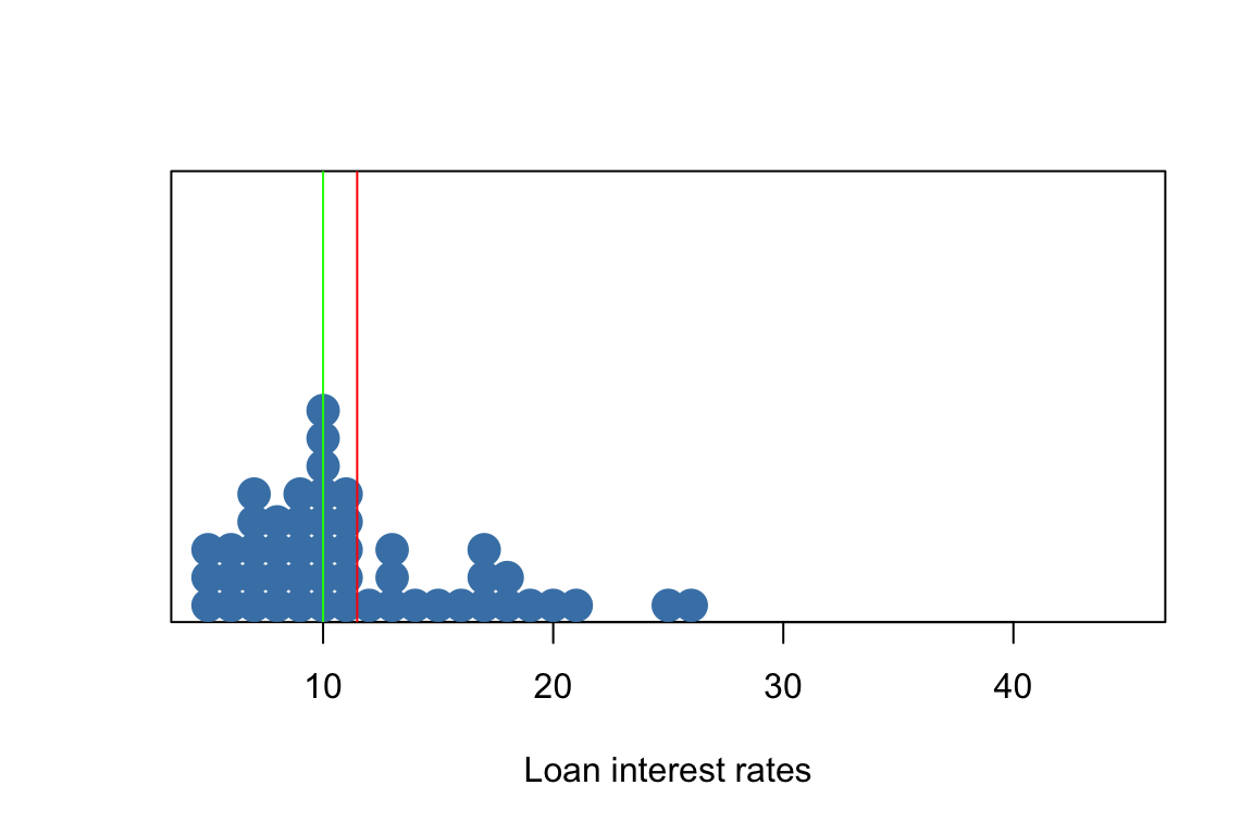
Robust statistics - Mean vs Median
- red = mean
- green = median

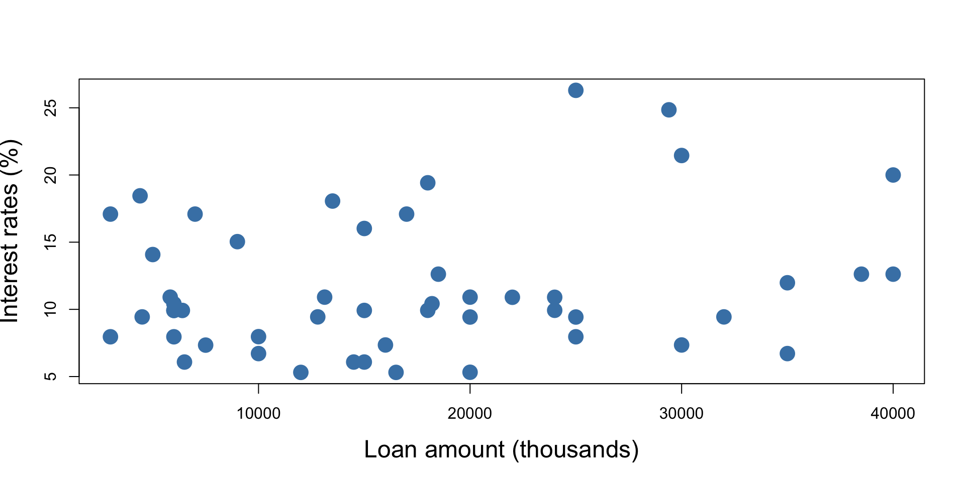
Scatterplots for paired data
A scatter plot is a chart that displays individual data points to show the relationship between two variables.

Scatterplots for paired data
Loan amount vs Income

Scatterplots for paired data
Interest rates vs Income